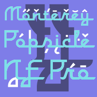
A faux script font typical of classic american branding. I have totally reworked all the letterforms: they started with a "notch" and ended flat - I have removed the "notch" and rounded off the ending stroke, so now you can actually start words with the lowercase letters. ;)
I have also improved the spacing (especially after the capitals), and of course added all the "foreign" glyphs. A classic is reborn! :)
Nick Curtis says: "Just another “somewhere from the thirties to the fifties” kinda script, named kinda after a sixties rock festival."


