|
|
||
|
||
|
|
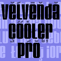
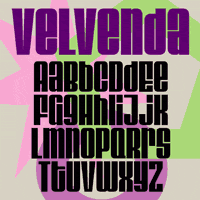
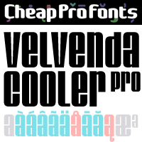
Very tight and very black font where (almost ;) all letters have the same height. The original font had a good glyph-set, but some bad diacritics. I have also redesigned some glyphs, and added some kerning - not much was needed for this compact design, though... ;)
Ray Larabie says: "Ultra-heavy condensed display type. 1960’s style, and inspired by a Sixties font called “Stark”. Comes in three styles: “Velvenda Cooler” was created in 2002 and has thicker counters for use in smaller print."
|
|
Velvenda Cooler Pro NEW Promo Picture
 
|
Velvenda Cooler Original Promo Picture
 
|


