|
|
||
|
||
|
|
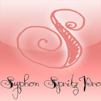
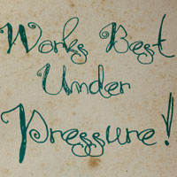
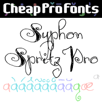
A free flowing and loose handwritten style, with the occasional double lines - and with quite elaborate and decorative initials. Feminine, but sloppy - an interesting combination. I have regularized the stroke thicknesses and modified a couple of the letterforms to make them less ambiguous. Some kerning and spacing completes the workover, together with our extensive language support.
|
|
Syphon Spritz Pro NEW Promo Picture
 
|
Syphon Spritz Original Promo Picture
 
|


