 |
|||||||||
|
Roger S. Nelsson
Brian Kent
Kevin King
Ray Larabie
Levente Halmos
Nick Curtis
Kimberly Geswein
Derek Vogelpohl
Ronna Penner
Guillaume Séguin
Vic Fieger
Paul Lloyd
David Kerkhoff
Futuristic fonts
Retro fonts...
Text fonts...
Script fonts...
Christmas fonts
Grunge fonts
Faux fonts
Novelty fonts
Picture Fonts
|
|

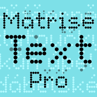
 A more oldstyle looking variant of the previous release Matrise Pro -again using some slightly smaller dots when designing the diacritics - this makes them easier to separate from the main letters. I have also used variable letter widths (and kerning), as opposed to the technology's original monospaced design - this to make the text more readable :)
