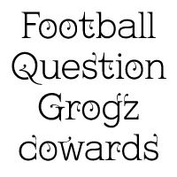
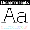
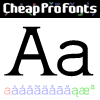
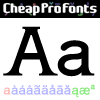
This is what you get when you mix monoline rounded letters with some bracketed serifs and finish it off with a sprinkle of ornamental appendages. The result is very readable, rather original and quite charming. :)
I have fixed some inconsistencies in serif designs across the weights, cleaned up the serif connections - and added a fourth weight. But I have kept all the wonky curves and slightly differing stroke thicknesses, as they are so integral to the charm.
Kevin King says: «I guess all type designers at some point think "Well, I'll just have a go at a standard text face..." There is a long story here somewhere, suffice it to say that I started with the thinnest version - typical. I wanted to make a standard serif text face - until I saw it in print and thought "Yuk! it looks like everything else!" - still does really but with twiddles and pooneys...»
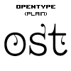
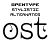
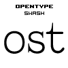
If you find the "twiddles & pooneys" too much you can tone them down with the OpenType "Stylistic Alternate" feature (which will make sure they don't appear on three consecutive letters) or remove them completely with the OpenType "Swash" feature.


Kingthings Serifique Pro Light is a professionally reworked font that contains an extended character set for setting text in 65 languages requiring more than the basic A-Z!


