|
|
 |
|
|
|
|
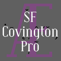 Font #39: SF Covington Pro
08.10.08 12:00
A wonderful and elegant typeface from Derek Vogelpohls skilled hands. Little work was needed to rework this neat font to a professional standard - I have tweaked a few letterforms, redone the kerning, and redesigned and expanded the diacritics. Result! :)
|
|
|
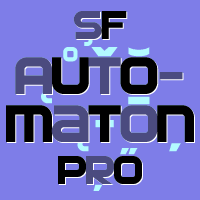 Font #38: SF Automaton Pro
04.10.08 12:00
The original font had only one case of letters - duplicated for upper and lower case positions (except the "stencil" z included to be able to set the Mazda® logo ;) But I took the opportunity to create some alternates - to make it even more versatile. As the letters are very solid, I also remade the diacritics to match this rugged look. All the letters of this font are touching, but that doesn't mean it was easy to space (it still needed some kerning pairs to allow the more open letters to touch, as well ;)
Derek Vogelpohl calls it: "A fast and sporty typeface with clean, sexy lines."
|
|
|
 Font #37: Trump Town Pro
26.09.08 12:00
Based on and adapted from Georg Trumps classic from 1930. This font was originally made with FontStruct but this Pro version have cleaned up outlines, quite a few tweaked letterforms (because of FontStructs limitations ;) , corrected spacing, and added kerning and hinting... It has also been scaled - and some additional diacritics added. I offer this font for free, so that you can download and test it to see how our multilingual fonts will work with your setup! :)
|
|
|
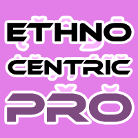 Font #36: Ethnocentric Pro
21.09.08 12:00
Another clean and stylistic font from Ray Larabie with just an uppercase alphabet - all the letters are duplicated in the lowercase positions. I have cleaned up the outlines, extended the T and 7 a bit, corrected the AE and OE ligatures, and redesigned the diacritics before expanding the character set.
Ray Larabie says: "Wide, Sans-serif display type. Inspired by hand lettering on a small-town hair salon."
|
|
|
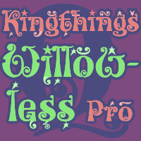
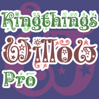 Font #35: Kingthings Willow Pro
15.09.08 12:00
If the previous release (Kingthings Willowless Pro) is a christmas font, well... Then this font is a christmas tree complete with decorations and lights! :D
This font is sooooo ornamented - but still quite readable.
Enjoy!
|
|
|
 Font #34: Kingthings Willowless Pro
07.09.08 12:00
This font just oozes christmas and holiday spirit from every curve of every letter! :)
I have cleaned up all the outlines, redesigned the F (which looked more like a J), tweaked some more letters and then expanded the font with the usual multilingual glyphs. I loved this font when I first saw it, but was very nervous that it would be difficult to design the accents - but it was a breeze! It has been one of the most enjoyable fonts to rework so far. Hope you will enjoy it, too.
|
|
|
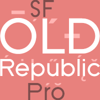 Font #33: SF Old Republic Pro
02.09.08 12:00
A more neutral version of SF New republic Pro ;)
Lowercase letters have spurs, and I have also here used the redesigned, softer "y" (but kept the original angular y as a stylistic alternate).
|
|
|
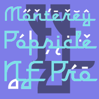 Font #32: Monterey Popsicle NF Pro
31.08.08 12:00
A faux script font typical of classic american branding. I have totally reworked all the letterforms: they started with a "notch" and ended flat - I have removed the "notch" and rounded off the ending stroke, so now you can actually start words with the lowercase letters. ;)
I have also improved the spacing (especially after the capitals), and of course added all the "foreign" glyphs. A classic is reborn! :)
|
|
|
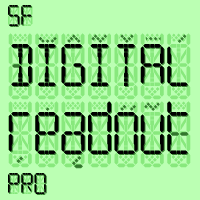 Font #31: SF Digital Readout Pro
25.08.08 12:00
No font collection would be complete without an LCD/Quartz font ;)
I have divided some elements into more segments, so that they would be more flexible when creating "foreign" letterforms. Then I created a lowercase alphabet to match the existing uppercase letters! I have also redesigned those glyphs that did not slavishly follow the fixed elements. The result is a font were ALL glyphs are built from the defined elements - just like a proper LCD display!
|
|
|
 Font #30: SF New Republic Pro
21.08.08 12:00
The first font from Derek Vogelpohl given the CheapProFonts treatment - many more to come! ;) A fresh take of the geometric Futura® genre, with some modernised and twisted shapes - which works! :)
I have made a new lowercase y which blends better with the other round shapes of the font (but the original letter design is available as an OpenType Stylistic Alternate ;)
Can be used for longer passages of text, and adds a modern touch.
|
|
|
|
|
|
|
|
| New Releases |
 14.04.14 12:00
One of our bestsellers has just become even better. Celtic Garamond Pro has been polished up, and at the same time I have made to companions: A Bold version - for more emphasis!
A Rough version - for a more antique look! Enjoy! :)
|
|
|
|
| Rogers Blog |
|
27.09.20 9:48
Wow! It has been 8 years since my last entry! Time flies! This is just a quick note to let you all know this site and its owner is still alive. There are no new fonts being reworked and released at the moment, though - I am too busy with my daytime job and other projects.
|
|
|
|
|
|