|
|
 |
|
 |
|
|
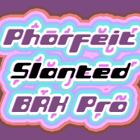
 Font #29: Phorfeit Slanted BRK Pro
02.08.08 12:00
A 20 degree slant, and this speedier variant of Brian Kents psychedelic font is ready for use (for those who use software where you cannot slant the upright version yourself ;)
|
|
|
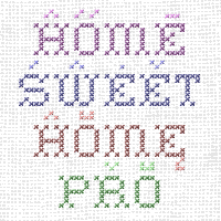
 Font #28: Home Sweet Home Pro
27.07.08 12:00
Nothing says cozy and homely like cross-stitching and needlework ;) This reworked version of Ray Larabies font is now ready for setting in lots of languages...
|
|
|
 Font #27: Phorfeit BRK Pro
13.07.08 12:00
This font from Brian Kent is perfect for that 70s hippie look. I have totally redrawn the outlines, and redesigned a couple of glyphs that were too "mechanical".
Part futuristic + part rounded = totally psychedelic ;)
|
|
|
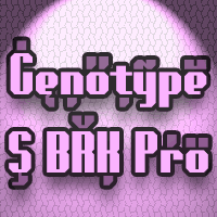
 Font #26: Genotype S BRK Pro
29.06.08 12:00
The perfect companion for the previous release: Genotype H BRK Pro (The H stands for Hollow and the S stands for Solid ;). Can be used as a fill for its companion (using layers), but is also quite a useable font on its own.
|
|
|
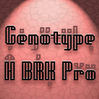
 Font #25: Genotype H BRK Pro
28.06.08 12:00
A stylistic and square outline font by Brian Kent - suitable for headlines and logomarks. The original font contained no diacritics at all, so I have designed these to match. I also made the descenders on "g/j/p/q/y" a bit longer - so they would balance better with the letters with diacritics below the letter...
I redesigned the "t", but have included the original "t" as an alternate, available via your programs' glyph palette or using the OpenType functions "Stylistic Alternates"/"ss01".
|
|
|
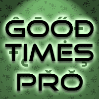
 Font #24: Good Times Pro
21.06.08 12:00
A very clean and stylistic font. Basically just an uppercase alphabet - with all the letters duplicated in the lowercase positions. I have corrected the AE and OE ligatures, and redesigned the diacritics before expanding the character set.
|
|
|
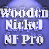
 Font #23: Wooden Nickel NF Pro
11.06.08 12:00
A nice, black display face by Nick Curtis - perfect for a retro/western poster look. I have kept the quirky "t", increased the dot above "i" and "j" slightly, improved the spacing/kerning and modified/added all the usual diacritics. A pretty easy reworking of a good quality font. :)
|
|
|
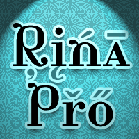
 Font #22: Rina Pro
06.06.08 12:00
«A fun font extrapolated from a "Bodoni" O and I» as Ray Larabie says about this peculiar, but nice looking Didone interpretation :). I have removed the tail from the C and G (as they could be mistaken for diacritics in foreign texts) - but they are still available as OpenType Stylistic Alternates ;). I then adjusted the existing diacritic letters to correct their design, and added lots of new ones. Beautiful and quirky!
|
|
|
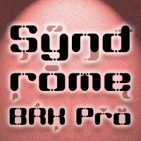
 Font #21: Syndrome BRK Pro
21.05.08 12:00
I just loved the design idea behind this font, but the original font had a lot of ugly artefacts - so I have completely redrawn ALL the letters, before expanding the character set. The lowercase have been redrawn with a higher x-height, making the font even more useable (with more "normal" word shapes ;)
|
|
|
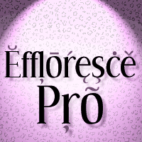
 Font #20: Effloresce Pro
17.05.08 12:00
«A delicate serif font with a hand drawn appearance, reminiscent of hand painted store signs. Naïve lettering inspired by lettering on a small-town tea shop near Guelph» as Ray larabie describes this elegant font.
I have adjusted the diacritics to allow better international text setting, modified some glyphs, and added lots of new ones.
|
|
|
|
|
|
 |
 |
| New Releases |
 14.04.14 12:00
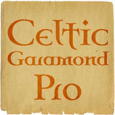
One of our bestsellers has just become even better. Celtic Garamond Pro has been polished up, and at the same time I have made to companions: A Bold version - for more emphasis!
A Rough version - for a more antique look! Enjoy! :)
|
|
|
|
| Rogers Blog |
|
27.09.20 9:48
Wow! It has been 8 years since my last entry! Time flies! This is just a quick note to let you all know this site and its owner is still alive. There are no new fonts being reworked and released at the moment, though - I am too busy with my daytime job and other projects.
|
|
|
|
|
|


