|
|
 |
|
|
|
|
 Font #142: DINfun Pro Random
26.03.11 12:00
Another grunge treatment to my variant of the classic DIN 1451 Mittelschrift: all control points and curves has been randomly moved around, giving it a slightly irregular look. Still just as readable in small sizes, though... ;) More DIN variants to come... :)
|
|
|
 Font #141: DINfun Pro College
20.03.11 12:00
A "double outline" variant of the classic DIN 1451 Mittelschrift - for that college jacket / university team look ;) The surrounding outline is placed outside the letter shapes, resulting in a font slightly larger than the rest of the family - so all the spacing and kerning has been redone. More DIN variants to come... :)
|
|
|
 Font #140: Krizi Amo Pro
08.03.11 12:00
Inspired by the lettering on a perfume, Halmos extrapolated a complete uppercase alphabet, and he also created a matching lowercase. Now the character set has been expanded completely, and this stylish Art Deco font is ready to create some headlines, new logos and wordmarks in many more languages.
|
|
|
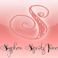 Font #139: Syphon Spritz Pro
14.02.11 12:00
A free flowing and loose handwritten style, with the occasional double lines - and with quite elaborate and decorative initials. Feminine, but sloppy - an interesting combination. I have regularized the stroke thicknesses and modified a couple of the letterforms to make them less ambiguous. Some kerning and spacing completes the workover, together with our extensive language support.
|
|
|
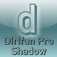 Font #138: DINfun Pro Shadow
29.01.11 12:00
A dropshadow variant of the classic DIN 1451 Mittelschrift - for that comic/cartoon look ;) Two variants included: one has been spaced a bit looser and kerning tweaked to avoid letter collisions, the other has the same metrics and kerning as the Plain version (so you can use the Plain version to fill it in by layering them ;) More DIN variants to come... :)
|
|
|
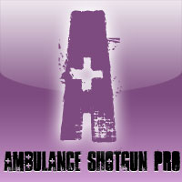 Font #137: Ambulance Shotgun Pro
24.01.11 12:00
Another grungy masterpiece from Guillaume - this one with a woodprint touch. I have made the lowercase letters different from the uppercase by removing the cross-shaped counters and flipping where possible. Even the numbers have solid variants - available as OpenType "Stylistic Alts". Enjoy the new flexible possibilities! :)
|
|
|
 Font #136: DINfun Pro Copperplate
31.12.10 12:00
A subtle serif treatment to my variant of the classic DIN 1451 Mittelschrift. With tiny serifs everywhere the letterforms become as classic as Copperplate Gothic - but still with that strict DIN look. If you set text in all UPPERCASE: space the text a little extra, and the Copperplate impression is complete ;) More DIN variants to come... :)
|
|
|
 Font #135: Nordic Pro
29.12.10 12:00
A very solid, square and sturdy font, but with some special and quirky details. It is perfect for logos and trademarks - and now supporting many more languages. :)
|
|
|
 Font #134: Armalite Rifle Pro
18.12.10 12:00
Military style stencil type, badly bruised by shotgun fire, wear and tear. Now ready for action in more languages!
Vic Fieger says: "The original letterforms were not the famous military stencil, but were drawn freehand then scanned into Photoshop. Next, they were altered using a series of brushes before being imported into a font.
This font has been used in the Flash games Pandemic and Artillery."
|
|
|
 Font #133: DINfun Pro Counterless
13.12.10 12:00
A simple and "traditional" grunge treatment to my variant of the classic DIN 1451 Mittelschrift - with the counters removed you can more easily fill them with something, or just leave them as blotches in the text. ;) More DIN variants to come... :)
|
|
|
|
|
|
|
|
| New Releases |
 14.04.14 12:00
One of our bestsellers has just become even better. Celtic Garamond Pro has been polished up, and at the same time I have made to companions: A Bold version - for more emphasis!
A Rough version - for a more antique look! Enjoy! :)
|
|
|
|
| Rogers Blog |
|
27.09.20 9:48
Wow! It has been 8 years since my last entry! Time flies! This is just a quick note to let you all know this site and its owner is still alive. There are no new fonts being reworked and released at the moment, though - I am too busy with my daytime job and other projects.
|
|
|
|
|
|