|
|
 |
|
|
|
|
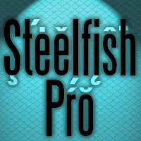 Font #19: Steelfish Pro
12.05.08 12:00
This very narrow sans serif font by Ray Larabie have been given a thorough cleanup - lots of wrongly designed diacritical letters have been corrected, and even more added. This font is now ready to create movieposter credits in many languages! ;)
|
|
|
 Font #18: Cowboy Hippie Pro
03.05.08 12:00
Inspired by and adapted from Stretto from Canada Type - which again was inspired and expanded from Sintex by Aldo Novarese. This font was originally made with FontStruct but this Pro version have cleaned up outlines, corrected spacing, and added kerning... Also includes an alternate "a", available via your programs' glyph palette or using the OpenType functions "Stylistic Alternates"/"ss01". I offer this font for free, so that you can download and test it to see how our multilingual fonts will work with your setup! :)
|
|
|
 Font #17: Neuropolitical Pro
27.04.08 12:00
Neuropol is one of Ray Larabies most popular fonts, and I have expanded this squared-off version (Ray Larabie calls it: «"Neuropol" with squared ends») with our usual large character set.
|
|
|
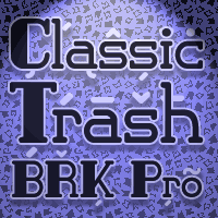 Font #16: Classic Trash BRK Pro
22.04.08 12:00
A typical Art Deco font with high contrast. I have mirrored the uppercase A and M to give the strokes a correct direction, and shortened/widened a few lowercase letters to give the text a more even colour. A stylistic 30s-looking font is ready for international text-setting!
|
|
|
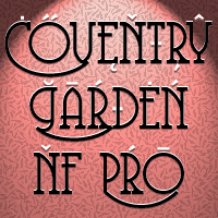 Font #15: Coventry Garden NF Pro
13.04.08 12:00
About time I reworked a lighter font - I have been doing a lof of very black fonts...;)
I have improved and added diacritics to this elegant alphabet by Nick Curtis, and generally cleaned it up to a professional standard. It is well suited to logos, menus, invitations and other things wanting a touch of elegance ;)
|
|
|
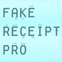 Font #14: Fake Receipt Pro
29.03.08 12:00
Ray Larabie says aout the original font: «An all caps, distressed dot matrix font; the type often seen on cash register receipts.»
Again, I have mirrored the symmetrical characters for the lowercase - allowing for a slightly more varied look. In addition to correcting and expanding the character set, of course.
|
|
|
 Font #13: Shlop Pro
24.03.08 12:00
The 13th font reworked for a multilingual character set for this site of course had to be in the horror genre ;) The original font was all caps, but I have mirrored the symmetrical characters for the lowercase - allowing for a more varied look.
|
|
|
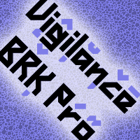 Font #12: Vigilance BRK Pro
21.03.08 12:00
A very angular font, not one curve in sight - it's hip to be square! The original font -by Brian Kent- included quite a few alternate letterforms, which I've also made available in combinations with all the international diacritics. It is the most advanced font on this site so far :)
|
|
|
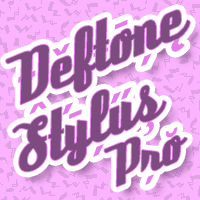 Font #11: Deftone Stylus Pro
17.03.08 12:00
A nice 50s/retro script :) I have made a new "x" and modified the spacing so that it all connects beautifully - I have even made an alternate "s" for that awkward "os" combination! In addition to correcting and expanding the character set, of course.
|
|
|
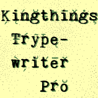 Font #10: Kingthings Trypewriter Pro
11.03.08 12:00
I have made this font properly monospaced (all characters are the same width) as that is how an old typewriter worked. In addition to correcting and expanding the character set, of course.
Keving King says this about his original font: "Kingthings Trypewriter is a deconstructed typewriter face. I have always loved decayed fonts, this is the first of mine - and yes, I know there are lots of these around - this one is MINE"
|
|
|
|
|
|
|
|
| New Releases |
 14.04.14 12:00
One of our bestsellers has just become even better. Celtic Garamond Pro has been polished up, and at the same time I have made to companions: A Bold version - for more emphasis!
A Rough version - for a more antique look! Enjoy! :)
|
|
|
|
| Rogers Blog |
|
27.09.20 9:48
Wow! It has been 8 years since my last entry! Time flies! This is just a quick note to let you all know this site and its owner is still alive. There are no new fonts being reworked and released at the moment, though - I am too busy with my daytime job and other projects.
|
|
|
|
|
|